
Fall Colour and Pattern Trends for Home Textiles
Rust, goldenrod and olive; maple leaves, pumpkins and buffalo check — how to build a fall range that mixes prints, plaids and solids.
The palette
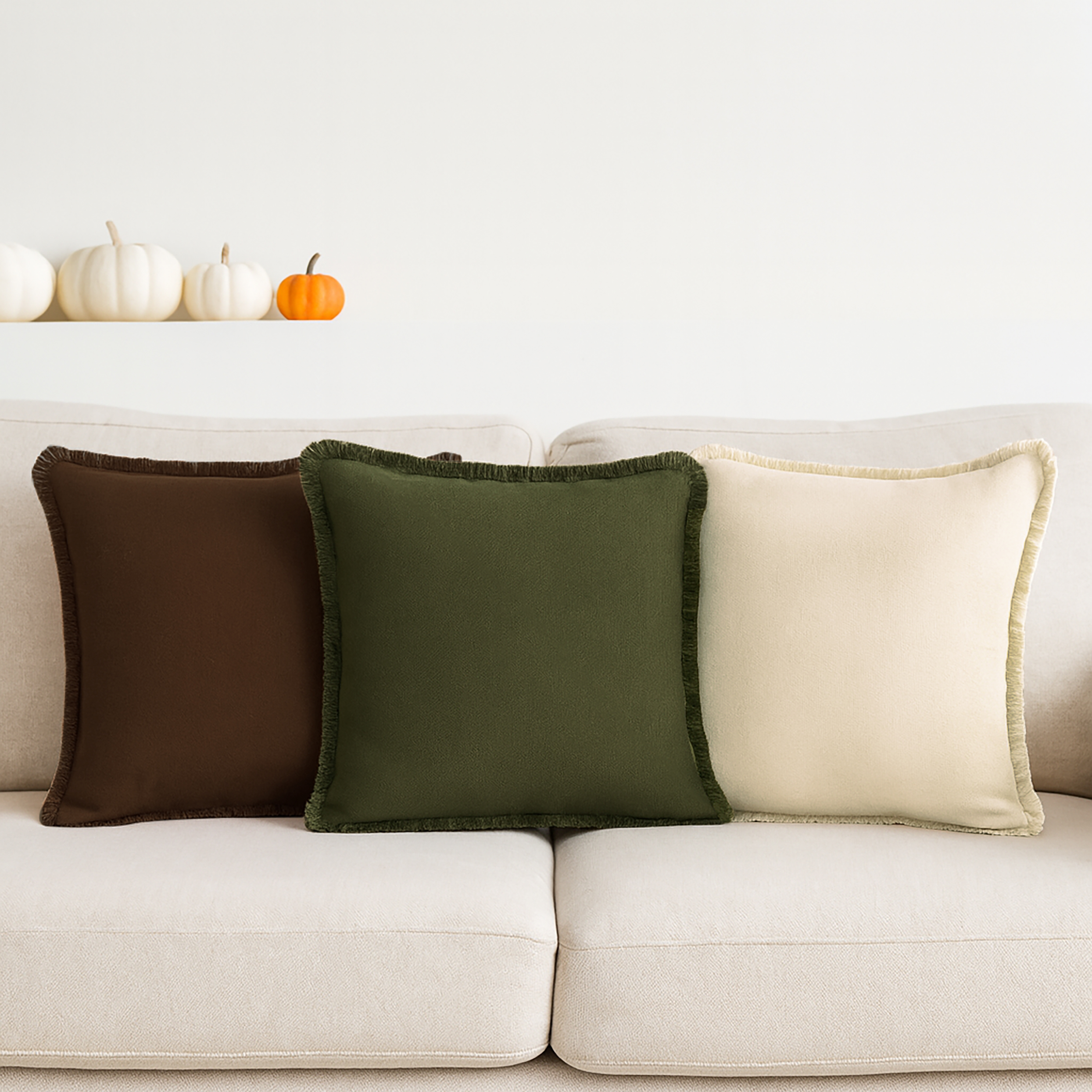
Fall colour in table and kitchen linen has settled into a dependable core: rust and terracotta as the anchor, goldenrod and mustard for warmth, olive and sage for contrast, and nut brown, cream and heather white to hold the table together. Burgundy and forest green sit at the edge of the season and carry straight into Christmas, which makes them useful for stock that has to work twice.
Prints that sell
Leaf prints remain the biggest fall story — scattered maple leaves on cream, tonal leaves on rust, and dense “heap of autumn” all-overs. Pumpkins follow, from watercolour patches to simple line-drawn stacks, and they perform best on kitchen towels, pot holders and placemats where the motif reads at a glance. Typographic prints (“Hello Pumpkin”, “Give Thanks”) work as accents on a towel or runner rather than across a whole set.
Plaids and checks
Buffalo check in rust and white, orange and nut brown, or black and white is the workhorse of the season, and homestead and tartan plaids add a woven, heritage feel. Because they are yarn-dyed, they carry from Thanksgiving through the winter without looking dated.
Texture
Fall ranges lean on touch as much as colour: waffle weaves for kitchen towels, ribbed and dobby stripes for runners, fringed and tasselled edges, and hemstitch on solid napkins. Chambray and slub yarns give solids a lived-in surface that photographs well in flat lays.
Building the range
A balanced fall assortment usually follows a 40 / 30 / 30 split: 40 percent solids and checks in the core palette, 30 percent leaf and pumpkin prints, and 30 percent coordinated sets that combine both — a printed runner with solid napkins, or a check tablecloth with a leaf pillow cover. That structure gives retailers a table they can merchandise as a whole while limiting exposure to any single print.